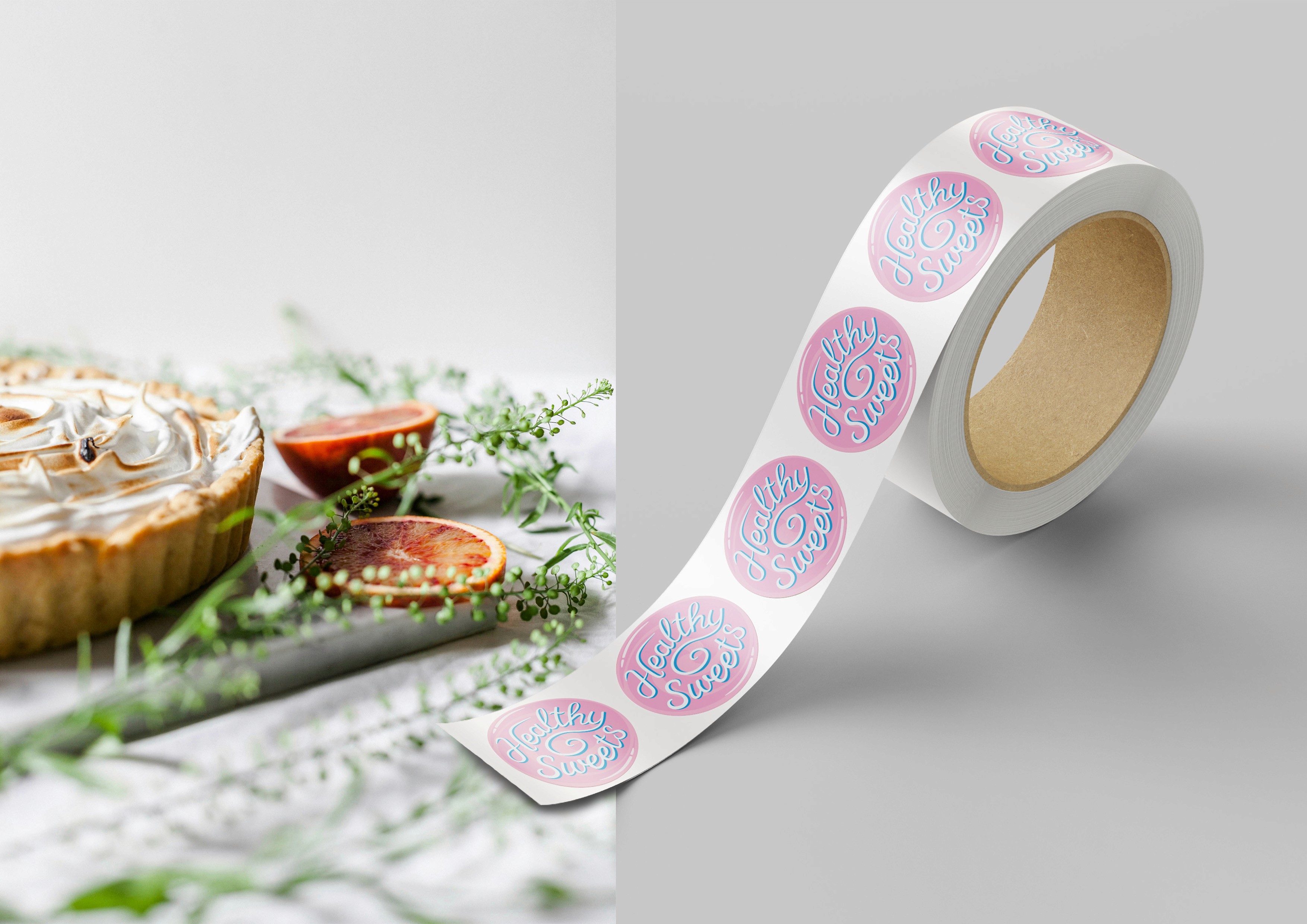
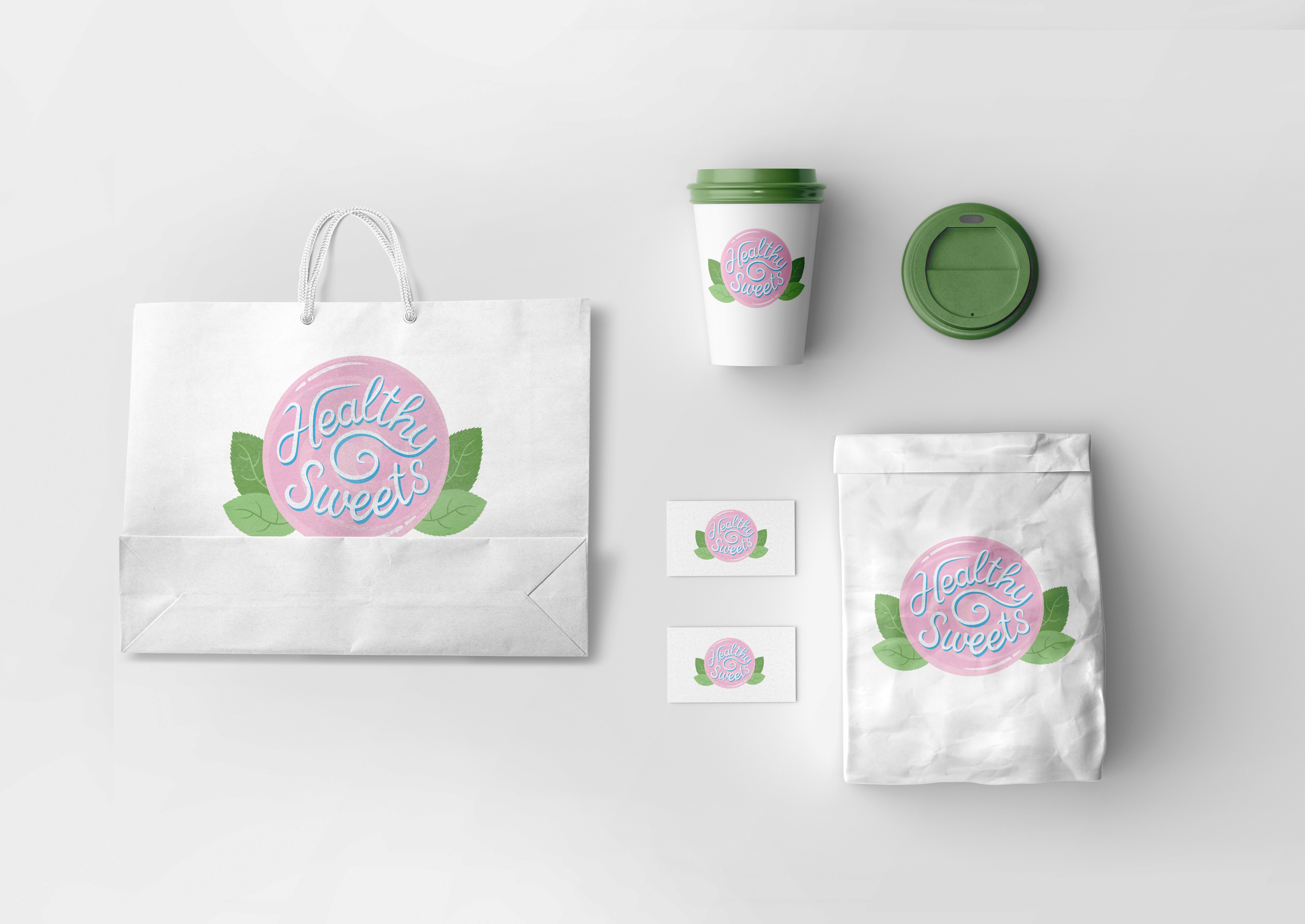
Logo for a Sweet shop «Healthy Sweets»
A thoughtfully designed logo that visually balances the concepts of sweetness and health for a modern confectionery brand. Custom typography and symbolic elements create a clear and unified brand identity.
Adobe Illustrator
Logo

Project Goal:
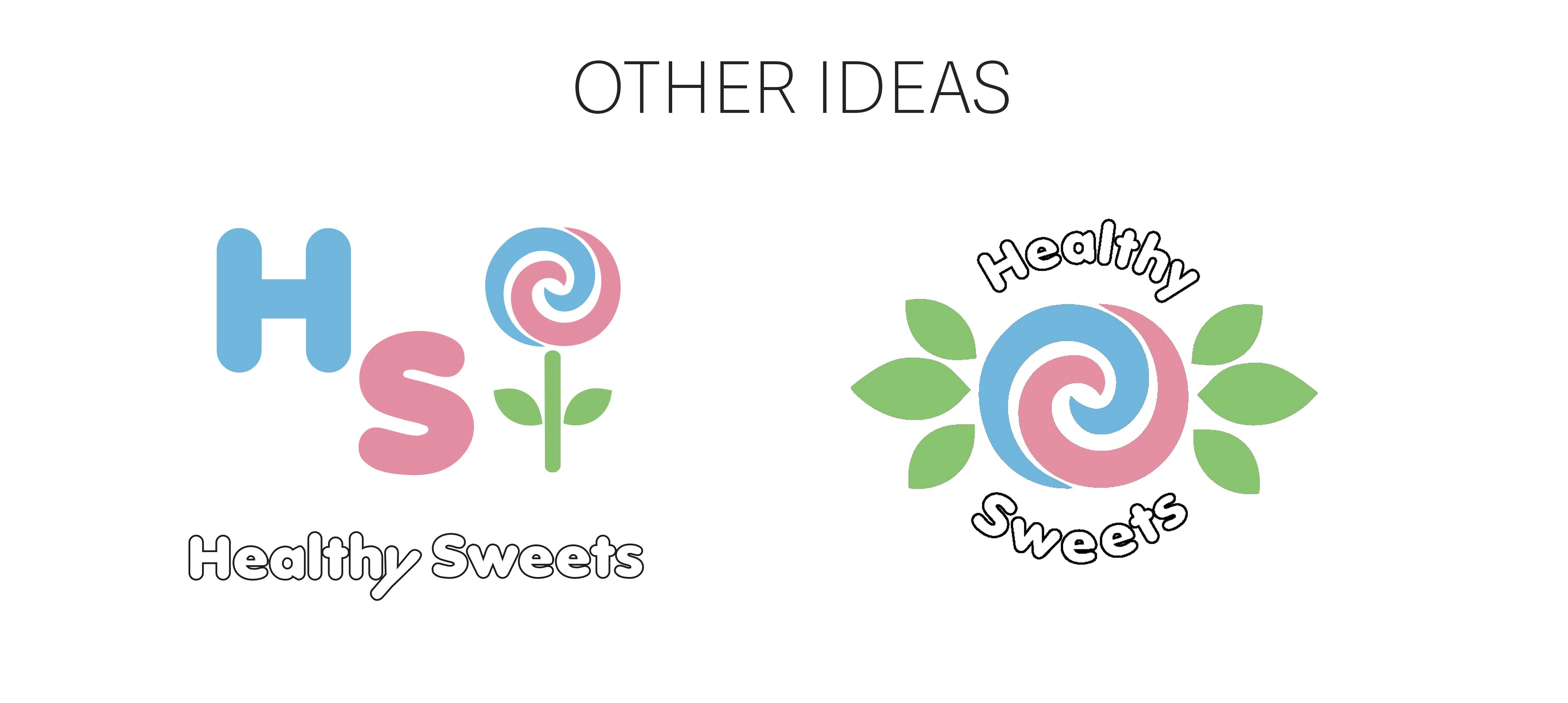
I decided to create a logo for a fictional shop «Healthy Sweets» to improve my skills in using typography for logo design and learn how to combine graphics with text in a clear way.
Type of work: Academic project
Idea and Concept:
This project is an improved version of an idea I tried before. I wanted to combine sweets and a healthy lifestyle into one simple and easy-to-recognize design. The main shape of the logo is a circle with spiral parts that look like a lollipop. Green mint leaves show freshness, nature, and health.
Style and Visual Solutions:
Colors:
Pink — reminds you of sweets.
Green — makes you think of mint and freshness.
Blue — helps the white text stand out on the pink background.
Typography: I hand-drew the brand name Healthy Sweets myself using the Pen Tool in Adobe Illustrator. The text follows a curved line, and the tail of the letter “y” curls into a spiral, which helps support the main idea.
Target Audience:
Children, families with kids, young people, and anyone who cares about healthy living.
Software: Adobe Illustrator
Date: June 2025
Final result